

The Challenge
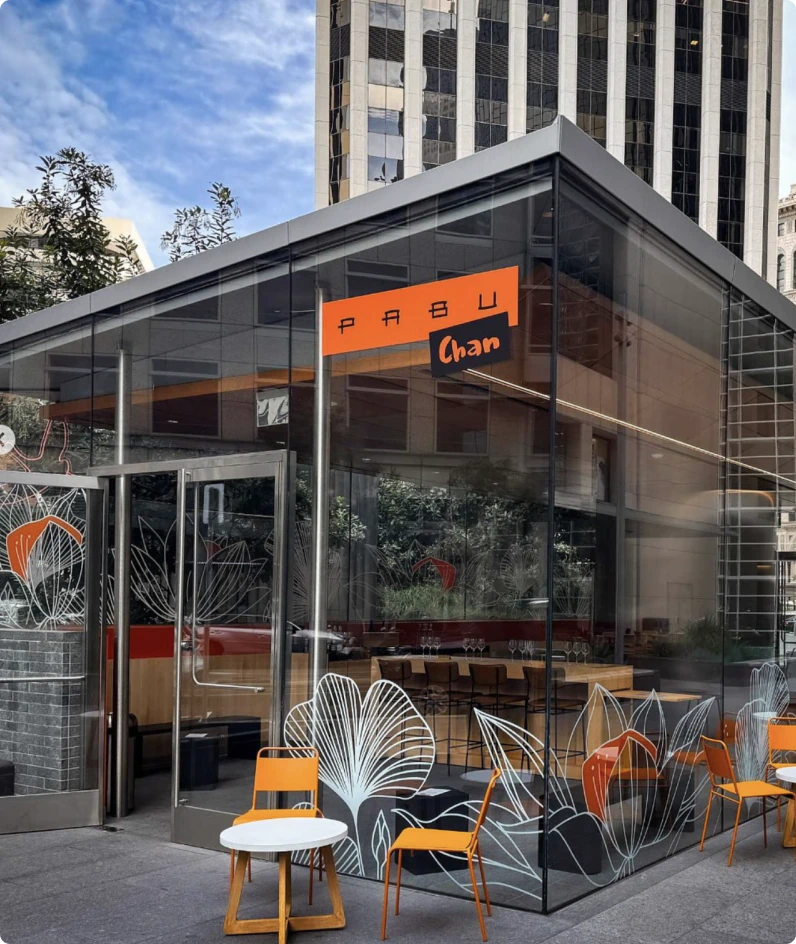
Pabu’s identity had not been refreshed in years and relied on a minimal design system with limited assets, making it difficult to support seasonal events and marketing moments. The brand also needed a more flexible visual language that could scale to future concepts and locations, including their new sake bar sub-brand, Pabu Chan.
The Result
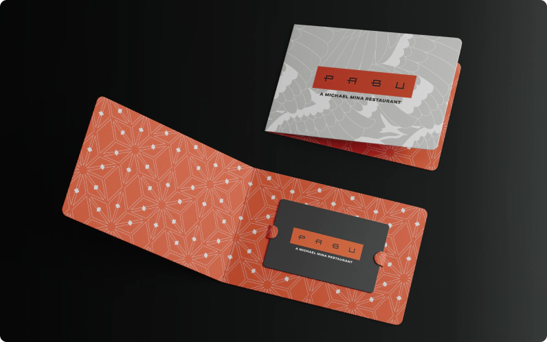
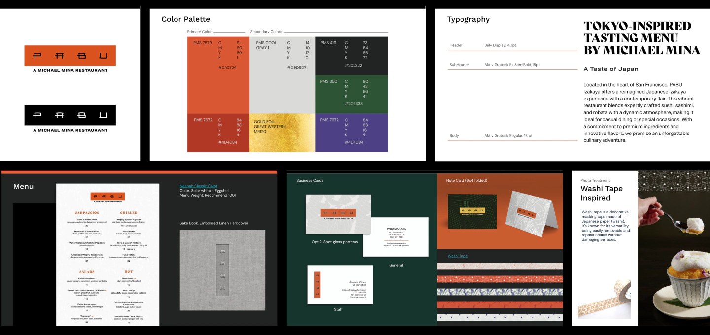
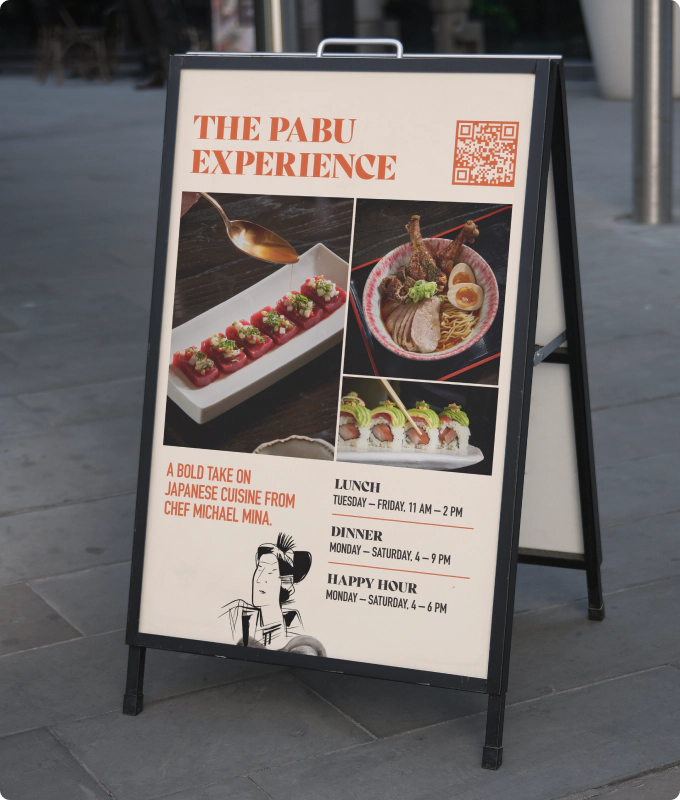
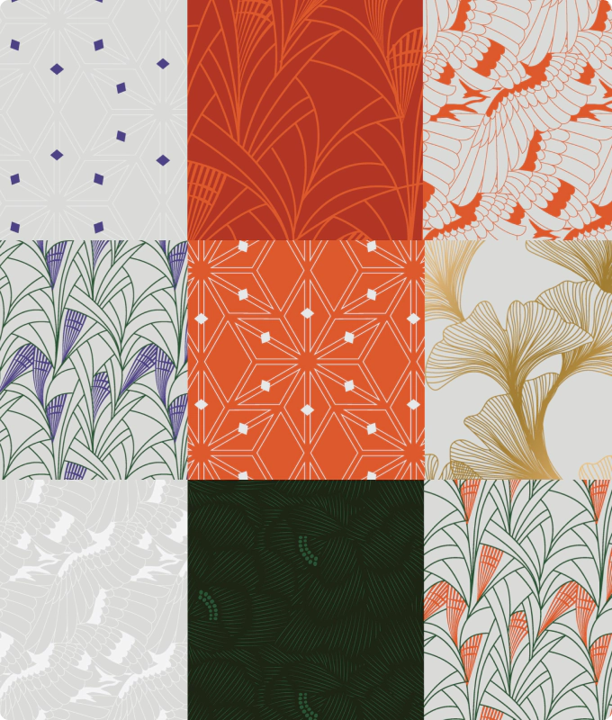
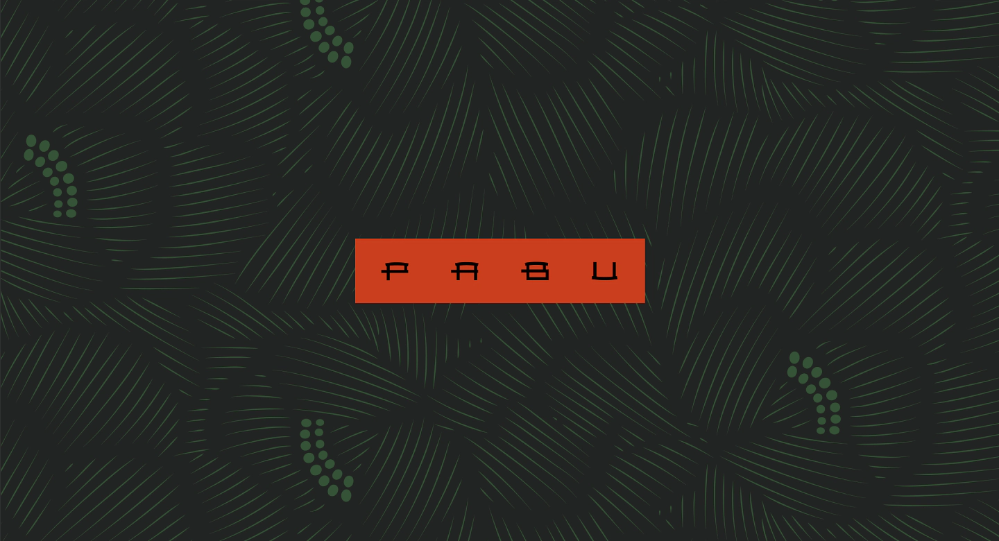
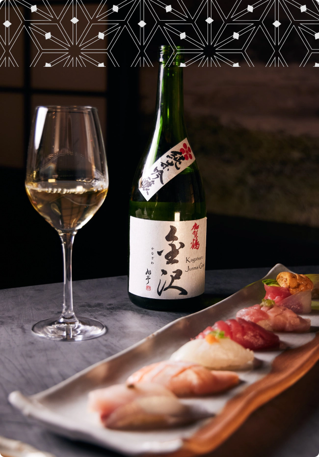
We expanded the visual system with patterns inspired by traditional Japanese motifs, applied playfully like layers of washi tape. An extended color palette introduced warmth and expression, softening the brand’s previously cold aesthetic. The system was designed to scale across new formats, including the Pabu Chan sub-brand and environmental applications like the Glass Box, creating a flexible identity that feels both contemporary and rooted in Japanese craft.
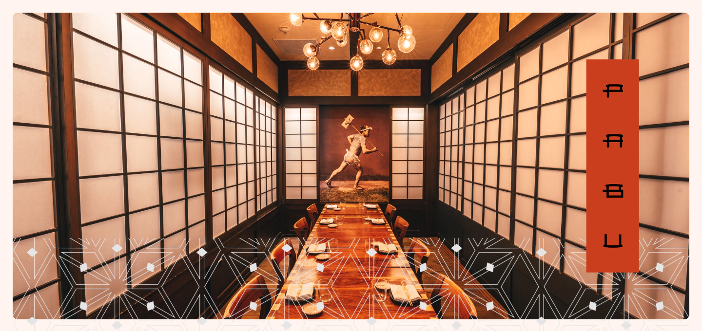
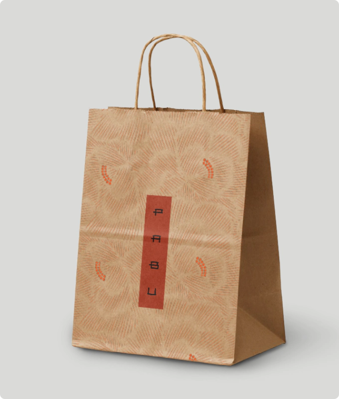
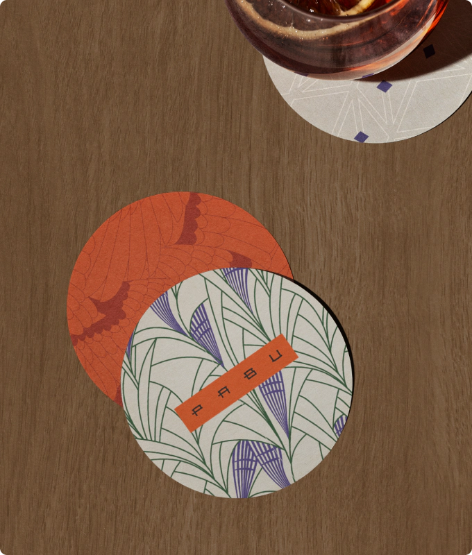
Japanese woodblock print patterns symbolize longevity, peace, and good fortune, reflecting harmony between nature and life.